Most Annual Trend Lists Are Written for Designers, Not Business Owners
Every January, the internet floods with "top web design trends" articles — each one showcasing bleeding-edge visuals built by creative agencies for Fortune 500 budgets. The problem? Most of those trends mean nothing for a plumber in Columbus or a hair salon in Austin trying to book more appointments.
This guide cuts through the noise. We're going to look at the web design trends 2026 that genuinely move the needle for service businesses and local shops — and call out the ones that look impressive in a design portfolio but actively hurt your conversion rate.
The Filter You Should Use Before Adopting Any Trend
Before adding any new design element to your site, run it through three questions:
- Does it make it faster or easier for someone to contact or buy from me?
- Does it load quickly on a mid-range phone on a 4G connection?
- Would a 55-year-old first-time visitor understand what to do next?
If a trend fails any of those three tests, it belongs in the "skip" column — no matter how many design awards it wins.
Trends Worth Adopting in 2026
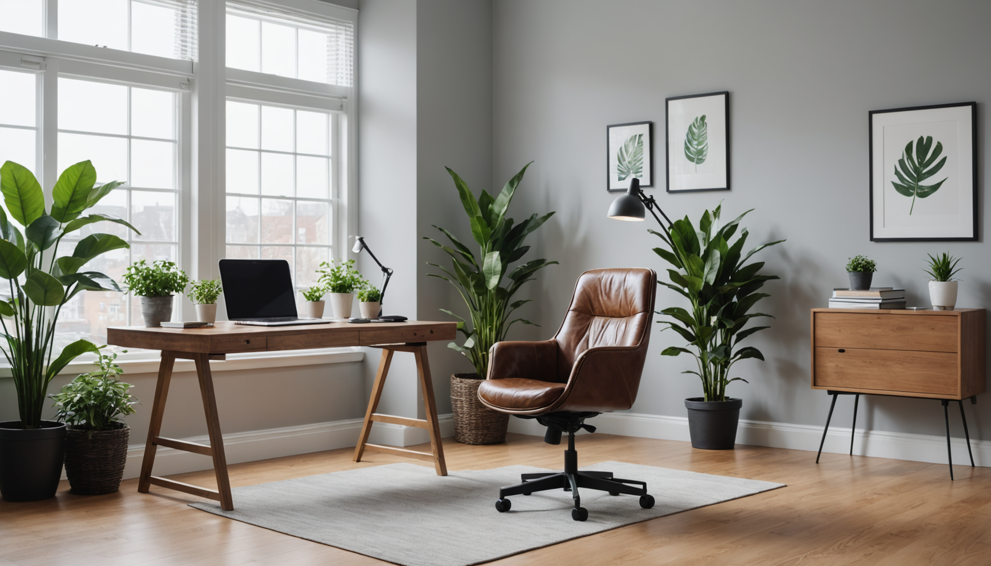
1. Brutally Clear Hero Sections
The most effective shift in modern website design right now isn't aesthetic — it's editorial. The best-performing home pages in 2026 open with a single, plain-English sentence that tells a visitor exactly what you do and who you do it for. No taglines. No abstract brand promises.
"Columbus's fastest same-day HVAC repair" beats "Comfort is our commitment" every single time. Visitors decide in under three seconds whether they're in the right place. Make it obvious.
Pair that clear headline with one visible call-to-action button above the fold. Not two. Not three. One. The trend toward stripped-back hero sections is accelerating in 2026, and it's working because it respects a visitor's time.
2. Thumb-First Mobile Layouts
In 2026, more than 65% of small business website traffic arrives on a mobile device — and most of that browsing happens one-handed. "Thumb-first" design means your primary action buttons sit in the lower third of the screen where a thumb naturally rests, not crammed into a top navigation bar that requires two hands to reach.
This is one of the website design best practices 2026 that costs nothing to implement and directly improves contact form submissions and click-to-call rates. Check out how FlowFix Plumbing handles this — the contact prompt is front and center at a thumb-friendly position, making it effortless for someone to reach out from a job site or their car.
3. Authentic Photography Over Stock
Stock photos have been declining in effectiveness for years, but 2026 marks the point where AI-generated imagery has made generic visuals so abundant that authenticity has become a genuine competitive advantage. Real photos of your team, your workspace, your actual work — even taken on a decent smartphone — outperform polished stock in trust signals and time-on-page metrics.
This is especially true for service businesses. A photo of your actual technician, your real storefront, or your literal product builds the kind of credibility that no license-free image library can replicate.
4. Structured Local SEO Signals in the Design Itself
The most underrated small business design trend of 2026 has nothing to do with how a site looks — it's about the invisible data baked into the page. Structured data (specifically LocalBusiness schema) tells Google exactly what your business does, where it operates, and how to contact you. Sites that implement this correctly show up more prominently in local search results and map packs.
This isn't something most small business owners think of as a "design" decision, but it absolutely is — it should be a default output of any site you build or redesign, not an afterthought.
5. Social Proof That Loads Fast
Reviews, testimonials, and case results are more persuasive than ever — but the way they're displayed matters. Embedding a live third-party review widget that phones home to an external server on every page load adds latency and can hurt your Core Web Vitals score. The trend for 2026 is to display curated, static testimonials directly in your site's HTML, with a simple link to your Google or Yelp profile for those who want to verify.
Fast-loading social proof converts better than slow-loading social proof. Always. See how Greenfield Law weaves trust signals naturally into its layout — credibility without clutter, and no third-party widget drag.
6. Accessible Color Contrast and Readable Type
WCAG accessibility standards aren't just a compliance issue in 2026 — they're a conversion issue. Light gray text on a white background, tiny font sizes, and low-contrast CTAs all reduce the number of people who can actually use your site comfortably. As screen time increases and the average age of online shoppers rises, legibility is a direct revenue driver.
The trend here is toward bold, high-contrast body text (minimum 16px), clear visual hierarchy, and CTA buttons that don't require squinting. This isn't a sacrifice of aesthetics — well-executed accessible design looks clean and modern.
Trends Worth Skipping in 2026
Skip: Parallax Scrolling and Heavy Scroll Animations
Parallax effects — where background images move at a different speed than foreground content as you scroll — have been a staple of agency portfolio sites for years. They're also one of the most reliable ways to tank your mobile performance score and trigger motion sickness in a meaningful percentage of your visitors.
For service businesses, scroll animations that delay content from appearing until the user reaches a certain point are especially damaging. If someone has to scroll past an animation before they can see your phone number, you've prioritized style over the conversion you need.
Skip: Dark Mode as a Default
Dark mode is a legitimate user preference, and offering it as an option is fine. But defaulting your small business site to a dark color scheme because it looks dramatic in a mockup introduces real friction for local-search visitors — many of whom are browsing in bright daylight on a phone screen that makes dark text on dark backgrounds nearly unreadable.
Light backgrounds with strong color contrast remain the safest default for local and service businesses. Save the dark aesthetic for late-night entertainment or tech products where the audience expects it.
Skip: Oversized Cursor Effects and Custom Mouse Animations
Custom cursor replacements, blob-following mouse effects, and cursor trail animations were a novelty in 2024. By 2026 they read as dated agency show-offery — and more practically, they don't function at all on touch devices, which is where most of your traffic is coming from. Zero upside for service businesses.
Skip: Navigation Menus Hidden Behind Ambiguous Icons
The hamburger menu (three horizontal lines) has become acceptable on mobile because users have learned it. But hiding your desktop navigation behind an icon — or replacing your menu with an abstract grid or dot pattern — just because it looks minimal creates real confusion for first-time visitors.
Visible navigation on desktop isn't a dated convention. It's a conversion tool. Don't abstract it away in the name of minimalism.
Skip: AI-Generated Copy Pasted Directly Into the Site
This one will ruffle some feathers, but it needs to be said. AI writing tools are genuinely useful for drafting and structuring content — but pasting generic AI output directly onto your homepage without editing it into your actual voice is becoming easy for visitors to detect. It reads as impersonal and interchangeable, which is the opposite of what a local business needs.
Use AI to speed up your writing process. Don't use it as a replacement for the specific, human details — your story, your team, your neighborhood — that make someone trust you enough to call.
Putting It Together: A Practical 2026 Design Checklist
When evaluating your current site or planning a redesign, run through this checklist:
- Does the homepage tell a new visitor who you are, what you do, and where you do it within the first three seconds?
- Is there one clear action to take above the fold?
- Does the site load in under three seconds on a mobile connection?
- Is every block of body text at least 16px and high-contrast?
- Are your photos real, or do they look like they came from a stock library?
- Is LocalBusiness structured data embedded in the site?
- Are testimonials visible and fast-loading?
- Does the mobile layout put the most important action within thumb reach?
If your current site passes all eight, it's in good shape. If it fails three or more, a redesign is worth prioritizing this year.
The Fastest Way to Get a 2026-Ready Site
If your site is overdue for an update, SiteGlowUp lets you paste in your existing URL and see a fully redesigned, mobile-optimized preview in about five minutes — no card required until you approve it. The setup is a flat $99 one-time fee plus $10 a month for hosting, and the rebuilt site comes with LocalBusiness schema baked in automatically, along with a contact form, gallery, blog, and more.
The goal of good design in 2026 hasn't changed: help real people find you, trust you, and contact you. The trends worth following are the ones that make that easier. Everything else is noise.